A larger count is easy to understand and easy to misuse. If one payment program has more published complaints than another, the difference could involve size, observation time, reporting behavior, product mix or a genuine problem. The count alone cannot distinguish those explanations. Adding a denominator helps with one question but does not magically turn complaints into a representative survey.
The CFPB describes its complaint database as a nonrepresentative collection and cautions readers to consider size when comparing volumes. We have not collected a Fintwist complaint total or verified a matching account population for this lesson. Every number below is invented to demonstrate arithmetic. No fictional group stands for a real provider, issuer or product.
Separate the numerator from the population
A numerator counts something: published records, distinct consumers, incidents or transactions. Those are different units. A single narrative may describe several events; several records may involve one unresolved situation. Unless the dataset and method establish a conversion, call a count ‘records’ rather than ‘people harmed’ or ‘failures.’ A stronger noun cannot be created by a spreadsheet label.
A denominator also needs a unit and a period. Active accounts during a quarter, all cards ever issued, customers at year-end and total transactions are not interchangeable. For a rate to be interpretable, explain why the denominator represents the opportunities associated with the numerator. If you cannot verify the match, show the counts and state that a meaningful rate remains unavailable.
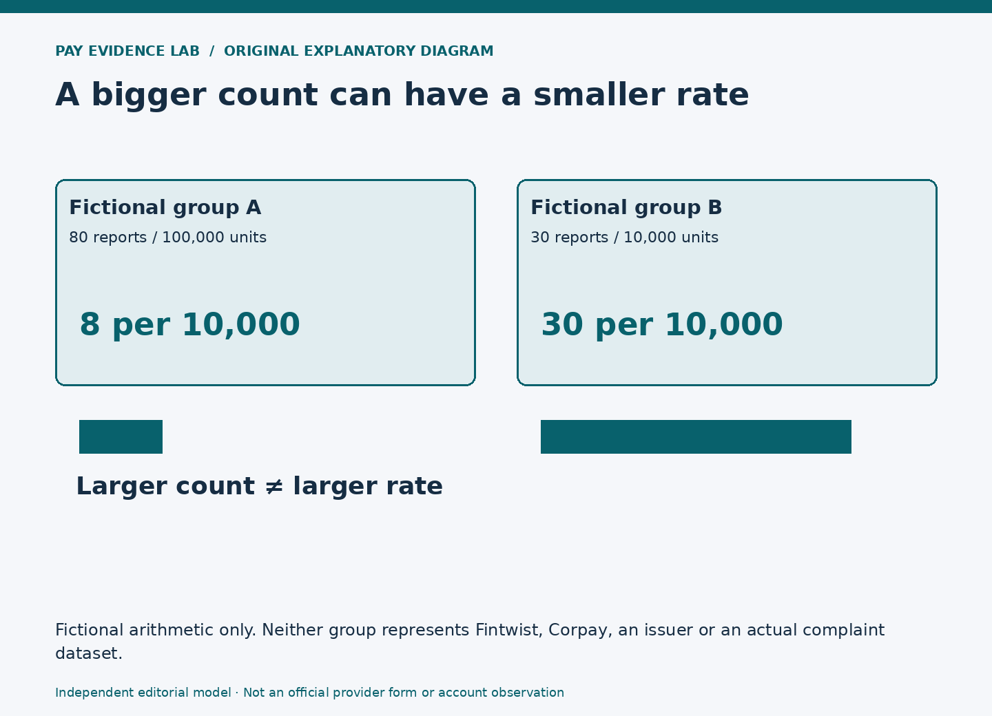
Suppose fictional Group A has 80 published reports and Group B has 30. A headline about ‘more reports in A’ is descriptively true within that invented table. It says nothing yet about an individual’s likelihood of having a problem. The missing exposure information is not a small footnote; it changes what the comparison means.
Work through the reversal
Now suppose the same fictional period contains 100,000 relevant units for A and 10,000 for B. Dividing reports by units and multiplying by 10,000 gives 8 reports per 10,000 units for A and 30 for B. The group with the larger count has the smaller calculated rate. This is a change in the comparison’s unit, not evidence that either real payment program is better.
The Denominator Sandbox on this publication’s home page lets you change those invented values. Begin with equal exposure, then increase only A’s exposure. Watch which statement changes and which does not. A’s raw count remains larger, while the relative rate can move in the opposite direction. Record both statements rather than choosing the one that produces a dramatic headline.
If the denominator is unknown, the tool suppresses the rate. This is an important analytical behavior. It is better to retain a blank output with a clear reason than to substitute a guessed customer count, an unrelated corporate figure or a convenient number from another product. A ratio created from mismatched units is not an improvement over an honest count.
A rate still has boundaries
Even a perfectly aligned exposure measure does not remove reporting differences. One group may know about a complaint channel, another may use a different regulator, and people may vary in whether they submit a complaint at all. The published records can illuminate the issues reported through that channel. They do not, by themselves, estimate every customer’s experience.
Avoid changing the label from ‘reports per 10,000 units’ to ‘percent of unhappy customers.’ The latter claims a measured attitude among people, which the arithmetic does not supply. Similarly, a complaint record is not an adjudicated finding that the provider caused the stated harm. Preserve the source’s status and the researcher’s limitations in both chart labels and accompanying prose.
Compare the same product purpose and observation window before comparing rates. Pooling payroll and other disbursement contexts can change the mix of reported issues even when no subgroup changes. A brand-level label may hide the very difference a reader needs to understand. Use the population-definition and product-mix guides before attempting a combined comparison.
Write the conclusion at the right level
A bounded fictional conclusion reads: ‘In the invented exercise, A has more reports in total but fewer reports per 10,000 assumed units. This demonstrates how exposure affects a comparison. It is not a reliability estimate.’ The conclusion is useful because it names both the arithmetic and the reason it cannot support a real-world ranking.
For actual research, document the numerator definition, denominator source, matching period, inclusion rules and remaining coverage limits. If any of these are unresolved, explain how that affects the conclusion rather than hiding uncertainty in a vague ‘results may vary’ line. A reader should know whether the obstacle is missing data, a mismatched unit or a limitation inherent in the source.
Stop when you can tell the difference between an observation and an inference. Seeing 80 records is an observation under a defined extraction. Dividing by a verified exposure is a calculation. Claiming that all cardholders face a particular risk is a much broader inference. Each step needs its own evidence; the mathematical neatness of the middle step cannot supply the missing evidence at the end.
Continue the investigation
Sources and scope
- External official source: CFPB: Consumer Complaint Database methodology — Publication coverage, nonrepresentative complaint sample and cautions about comparing volumes. Checked 2026-10-04.